

Hidden in the backgrounds of book covers…
When I was first discussing the cover for Mr. Real with my cover artist, Earthly Charms I had found this really cool wall paper pattern I wanted to use for the background. Colorful and grungy and just cool looking. I showed it to her, and she was almost horrified. I couldn’t have that be the background! It had nothing to do with the book.

Those words really stuck with me We had this whole back and forth about how backgrounds needed to be meaningful, and say something about the story. I kind of got into it, and we eventually found the house, pictured below, to use. Because it’s the key place in the story, and full of mystery, and almost another character.
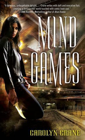
What’s funny is that, back when the artist was doing Mind Games, I was asked by Spectra for ideas on the background. I suggested a turnpike that looks like a rollercoaster (the Tangle!). I even sent them some twisty rollercoaster pictures and they did a really nice job with it. I didn’t think much of it at the time; I thought maybe they just didn’t have any good backgrounds laying around the office or something.
Since then, I’ve been really getting into backgrounds of book covers, especially paranormal and urban fantasy ones. The different things the artist and/or writer choose to portray.
Sometimes I look at the backgrounds more than the people in the foreground.
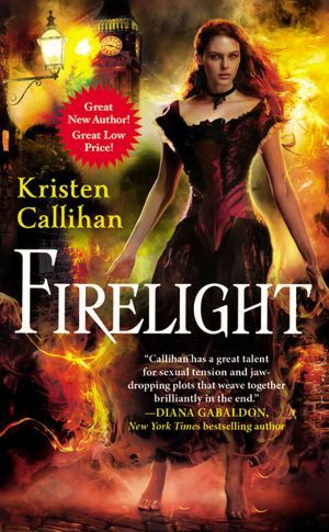
I love the backgrounds on this series! This is a beautiful Victorian London look, and there’s all that fire, because, of course, Miranda has power over fire. It’s also moody in feel, for a fabulously moody book. These backgrounds are significant and powerful.
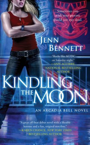
I love the way the Tiki theme comes alive here in this background, because of course, the main character owns a Tiki bar. And in general, there’s much magic in the air here. I couldn’t remember why the stairs were there, so I tweeted Jenn and asked her. She said: “the stairs heading down to Tambuku Tiki Lounge, like, symbolically? Underground/demon-friendly haven/underworld. Hidden.” I love that. Backgrounds are where it’s at!
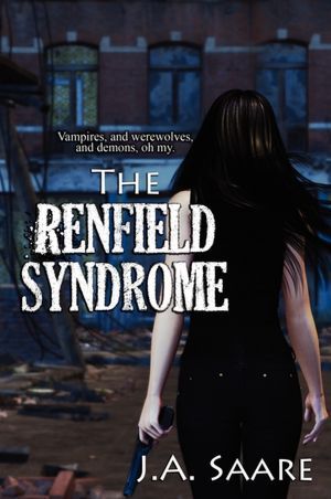
This is a fabulous background, set in a future New York gone wrong. I love the way the street is torn up. You know when that street is torn up, there’s trouble!
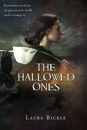
Laura Bickle’s fabulously frightening YA about an Amish girl who fights vampires. This background captures the forebodingness as it becomes clear all is not well with the world. I’m a sucker for animals in backgrounds, too, and here are the crows. They were kind of the first to sound the alarm. Also, I personally feel the brightest part of the cover being by Katie’s heart is no coincidence. Since it went so well asking Jenn about the underground thing, I asked Laura about the cap she holds. Laura’s own take: “I think that it's kind of symbolic of her faith. Hanging on and it slipping away.” Hmmm!! Laura also supplied this link to the full art. Even cooler!
http://blot.com/post/20865515379/the-hallowed-ones
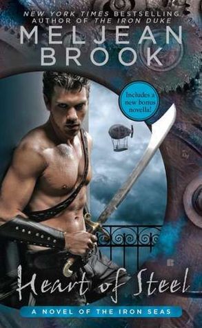
I so love this background. This is a high adventure romance, book #2 in the Iron Seas series. It’s a unique background, because you have the hero, Archimedes Fox, looking out through the whole metal/rivet & gears thing. The airship in the background is key, though, because they ride around on lots of airships and drop into dangerous places. The balcony behind him is presumably an airship balcony, suggesting something unseen below. I think the storm clouds are also purposeful.

This background captures the plot of this book so neatly – the heroine, Jennifer, accidentally opens a kind of gate and finds herself sucked into an ultra-enchanted fae realm where she herself has dangerous powers. I also love how sparkly the area around her is. The sparkles center on the heroine. In my mind, that’s no accident. I asked Jeffe if she saw anything else special. “I also love how his hand from the back is kind of translucently moving through her,” Jeffe says.
Okay, now I wish I’d asked all these authors for extra commentary. This is so interesting. Do all authors think about backgrounds so much? Anyway, I’m so focused on paranormal backgrounds these days. It’s kind of fun!!
When I was first discussing the cover for Mr. Real with my cover artist, Earthly Charms I had found this really cool wall paper pattern I wanted to use for the background. Colorful and grungy and just cool looking. I showed it to her, and she was almost horrified. I couldn’t have that be the background! It had nothing to do with the book.

Those words really stuck with me We had this whole back and forth about how backgrounds needed to be meaningful, and say something about the story. I kind of got into it, and we eventually found the house, pictured below, to use. Because it’s the key place in the story, and full of mystery, and almost another character.

What’s funny is that, back when the artist was doing Mind Games, I was asked by Spectra for ideas on the background. I suggested a turnpike that looks like a rollercoaster (the Tangle!). I even sent them some twisty rollercoaster pictures and they did a really nice job with it. I didn’t think much of it at the time; I thought maybe they just didn’t have any good backgrounds laying around the office or something.
Since then, I’ve been really getting into backgrounds of book covers, especially paranormal and urban fantasy ones. The different things the artist and/or writer choose to portray.
Sometimes I look at the backgrounds more than the people in the foreground.

I love the backgrounds on this series! This is a beautiful Victorian London look, and there’s all that fire, because, of course, Miranda has power over fire. It’s also moody in feel, for a fabulously moody book. These backgrounds are significant and powerful.

I love the way the Tiki theme comes alive here in this background, because of course, the main character owns a Tiki bar. And in general, there’s much magic in the air here. I couldn’t remember why the stairs were there, so I tweeted Jenn and asked her. She said: “the stairs heading down to Tambuku Tiki Lounge, like, symbolically? Underground/demon-friendly haven/underworld. Hidden.” I love that. Backgrounds are where it’s at!

This is a fabulous background, set in a future New York gone wrong. I love the way the street is torn up. You know when that street is torn up, there’s trouble!

Laura Bickle’s fabulously frightening YA about an Amish girl who fights vampires. This background captures the forebodingness as it becomes clear all is not well with the world. I’m a sucker for animals in backgrounds, too, and here are the crows. They were kind of the first to sound the alarm. Also, I personally feel the brightest part of the cover being by Katie’s heart is no coincidence. Since it went so well asking Jenn about the underground thing, I asked Laura about the cap she holds. Laura’s own take: “I think that it's kind of symbolic of her faith. Hanging on and it slipping away.” Hmmm!! Laura also supplied this link to the full art. Even cooler!
http://blot.com/post/20865515379/the-hallowed-ones

I so love this background. This is a high adventure romance, book #2 in the Iron Seas series. It’s a unique background, because you have the hero, Archimedes Fox, looking out through the whole metal/rivet & gears thing. The airship in the background is key, though, because they ride around on lots of airships and drop into dangerous places. The balcony behind him is presumably an airship balcony, suggesting something unseen below. I think the storm clouds are also purposeful.

This background captures the plot of this book so neatly – the heroine, Jennifer, accidentally opens a kind of gate and finds herself sucked into an ultra-enchanted fae realm where she herself has dangerous powers. I also love how sparkly the area around her is. The sparkles center on the heroine. In my mind, that’s no accident. I asked Jeffe if she saw anything else special. “I also love how his hand from the back is kind of translucently moving through her,” Jeffe says.
Okay, now I wish I’d asked all these authors for extra commentary. This is so interesting. Do all authors think about backgrounds so much? Anyway, I’m so focused on paranormal backgrounds these days. It’s kind of fun!!

The woman of his dreams…with the secret agent of his nightmares
Alix Gordon is a woman who doesn’t take life too seriously. What’s the fun in that? So when she stumbles across occult software that can bring any computer image to life, she conjures up lots of awesome outfits and accessories. And then, on one drunken, horny night, she conjures up Sir Kendall, the sexy TV ad spy . . . who looks exactly like Paul Reinhardt, the hot martial arts teacher who kicked her out of class a few years ago.
Fighter Paul Reinhardt has good reason to hate Sir Kendall, the character he brought to life to land a part in a TV ad; he’d do anything to forget him. A cross country road trip seems just the thing . . . until Paul finds himself inexplicably drawn to Minnesota and is shocked to discover Sir Kendall – in the flesh – with the girl he’d once loved from afar. He barges into Alix and Sir Kendall’s love nest, determined to stop the madness – somehow.
But is super spy Sir Kendall transforming into something more dangerous anyone can imagine? And what will Sir Kendall do when Paul and Alix finally give into their mad lust for each other?
Carolyn Crane is the author of the Disillusionists trilogy and assorted novellas. She lives in Minneapolis with her husband and two cats, and works a day job as a freelance writer. During rare moments when she’s not at her computer, she can be found reading in bed, running, or helping animals.
website: http://authorcarolyncrane.com/
twitter: https://twitter.com/CarolynCrane
blog - http://thethrillionthpage.blogspot.com/
fb: https://www.facebook.com/carolyn.crane2

So, what book background do you love?
Leave a comment for a chance to win a digital copy of Mr. Real!


I've never really paid that much attention to backgrounds. But after reading the post and looking at the covers, I'll be paying more attention now!
ReplyDeleteI love Mr Real's Background!
ReplyDeletetaccb_1981@yahoo.com
I like the background on Firelight. I'm a sucker for London. Put the hunk from Mr. Real on that background ...num num num!!!
ReplyDeletekitcat76(at)hotmail(dot)com
I like Kindling the Moon and the Tiki effect to represent the bar where the heroine works.
ReplyDeleteIf we're supposed to mention one of our own, Magic Strikes by Ilona Andrews. You've got the heroine using her sword which is a big part of the series and story, the ring where a lot of action takes place and her guy (to be) in shifter form.
acm05atjuno.com
I love all the covers of Darynda Jones' "Grave" series and Jeaniene Frost's vampire series - they both give the new reader a good idea of the characters and are all detailed in their own ways.I'm also in the middle of Nalini Singh's archangels books and like the way they've portrayed Elena. The first book has her looking alone and questioning, but, as the novels progress, she is stronger and more fierce. I like it when the front cover extendeds to the back cover, too.
ReplyDeleteI've always loved the backgrounds on Nalini Singh's Guild Hunter series. It spoke volumes about where the books took place and the characters personality as well.
ReplyDeleteCarolyn's Definitely stand out as well with their stunning backgrounds.
pickedbypoison@gmail.com
I love the backgrounds on Chlor Neill's, Meljean Brook's and Nalini Singh's Guild Hunter series...they really reflect what the setting of the books are!
ReplyDeleteHey, thanks everybody for stopping by! I'm so glad the UTC gang let me come talk about this. It's been fun!!
ReplyDeleteI do pay attention to pretty much everything on the cover - of the ones that were shown my favorites are Firelight and Mr. Real. Thanks for the giveaway
ReplyDeleteI almost always pay attention to the backgrounds on book covers. One I love right now is Haunted Moon by Yasmine Galenorn.
ReplyDeleteI tend to look at book covers as a whole and not seperate, but I guess I also sometimes miss a detail that way.
ReplyDeleteI love the spooky house in the backround of Anna Dressed in Blood.
I really like FIRELIGHT's background. I have always loved that book cover and how appealing it catches the eye. sdylion(at)gmail(dot)com
ReplyDeleteI LOVE Heart of Steel's background. That series' covers are quite beautiful.
ReplyDeleteKassandra
sionedkla@gmail.com
I like the background for Jeffe Kennedy's book, the colors and the stairs and everything look very magical. But my favorite is the cover for MR. REAL. The background house looks creepy and fun, but I really love the man in the front ;) You just can't go wrong with a tattooed, muscular, sexy man!
ReplyDeleteJune
manning_J2004 at yahoo dot com
Firelight. I love the colors.
ReplyDeleteLorimeehan 1 @ aol.com
I love The Poison Princess background. It really drew me in.
ReplyDeleteAnn(dot)Sheiring(at)gmail(dot)com
The Background on Cassandra Clare books (specifically the Mortal Instrument series) are really nice.
ReplyDeleteAlso, the Dark Protector Series by Rebecca Zanetti (Fated is my favorite cover) are beautiful covers with great backgrounds.
Finally, a recent find is the cover of Blood Rights (House of Comarré #1) by Kristen Painter. Very artistic.
I have to second and third the comments about Cassandra Clare's Mortal Instruments books. I also like the covers of S.M. Stirling's Dies the Fires books. One series I cannot stand the covers of (and took off the book jackets when I bought them hardcover) was Charlaine Harris' Sookie Stackhouse books.
ReplyDeleteOops - jochibi AT yahoo DOT com (forgot it in my post!)
ReplyDeleteHi
ReplyDeleteMy favorite is Firelight. Love those colors!!
Besides the background on Mr. Real, and Kindling the Moon, I love the background on Iced by KMM. Thanks for the post, very interesting discussion, and the contest. lisagk(at)yahoo(dot)com
ReplyDeleteI love the background on Brom's 'The Child Thief'; I love the fairy and sort of eerie motif against the distant modern bacnkground Peter's emerginf from.
ReplyDeleteI'm including the link here because it's too neat for people not to see:
http://www.bromart.com/childthief.html
I think the backgrounds on all the books featured give you a real sense of the story. FIRELIGHT stands out for me.
ReplyDeleteI like Kindling the Moon background. I like detailed background because I feel that they give you hints about the story.
ReplyDeleteWhat an interesting discussion! I'll definitely take closer looks at covers henceforth!
ReplyDeleteMy favorite is Meljean Brook's one.
I wish the LKH's Merry books would have more of the men on the covers ;)
I love the Firelight background! I haven't paid too much attention to the backgrounds, but now I'm going to check them out!
ReplyDeleteI tend to gravitate to graphically interesting books. It's amazing when all the details tell something about the story (I'm not a fan of stock photography and photoshopping details). I like settings for the background. My favorite covers elicit emotion or response. My favorite example is Karen Marie Monings hardback cover for Shadowfever. That is one amazing cover!
ReplyDeleteI love the background of Moon Called by Patricia Briggs. I have a think for wrought iron.
ReplyDeleteDoes anyone know why some covers do not accompany the ebook? I feel cheated if the cover is not included.
ReplyDeleteLove the Mr. Real cover.
Of the one's shown I love Kindling the Moon. The book backgrounds I really love are all of Gini Koch's Alien Novels, especially Touched by an Alien, there is just so much going on in each one.
ReplyDeleteI like most of them. Usually there's some that I just don't like. I like Mr. Real and Kindling The Moon's back grounds best.
ReplyDeleteDeAnna Schultz
sacredmoon1 (at) gmail (dot) com
I love Gini Koch's Alien series backgrounds. There is always so much going on and it usually depicts things that happen in the book.
ReplyDeleteRogue's Pawn and Firelight are my favorites.
ReplyDelete