

We have been discussing the change in cover trend for quite some time amongst ourselves and have decided to ask you how you feel about it. After the huge success of Fifty Shades of Grey we are seeing more and more erotic books trying to fit that Fifty "cover" mold. What do you think about it? Like it, hate it, tired of it? Do you find it just a sales strategy or does it make you more comfortable to pick up an erotic book and read it in public or leave it sitting around the family room? Leave us your comments!!
Here's what is running through our minds lately...

Tiffany Reisz’s Original Sinners series has recently had a
cover overhaul. The third book in the series, THE PRINCE, set to release in
November now features piano keys and a cane playing right into the Fifty Shades
of Grey phenomena. The original cover featured a blindfolded, sexy and
strong-jawed man who is supposed to be a young Kingsley if you’ve read the
books. Nom Nom!

Now we don’t get the sexy Kingsley! I miss the old cover so
much because I don’t think the new cover captures the sensuality of the series.
I hate how it’s become so subdued, almost as if we need to keep the contents of
these erotic books hush-hush. If you’ve read Reisz’s books, you know just how
hard-hitting and shocking her sex scenes are. For me, the new cover doesn’t
capture that. And it doesn’t match the other covers in the series! That drives
me nuts! But nevertheless, I am dying to read this book! Regardless of what the
cover looks like, THE PRINCE is my most anticipated book of this year.

Fiftyish covers seem to be dominating the new and re-releases of erotic books lately. In some instances I don't mind the change, like with Sylvia Day's BARED TO YOU. I loved the original indie cover, but I also love the new cover. However, I do find it fitting because Gideon Cross is a very classy guy and the new cover screams refined, sleek and sexy at the same time.


Ms. Day is also re-releasing her historical romance SEVEN YEARS TO SIN, which was her original inspiration for BARED TO YOU. Would you even consider this new cover a historical romance? Big fail for me.
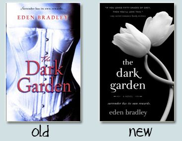
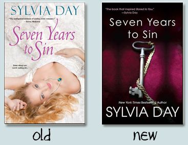 Other covers like THE DARK GARDEN by Eden Bradley I believe should've kept the original artwork. The story in this book is about a pretty intense couple where both hero and heroine have a lot of issues to work through. A flower just doesn't cut it for me.

Of course then there are new series that have completely embraced the Fifty cover theme, like in the serial by Beth Kery BECAUSE YOU ARE MINE. Yes they are pretty, and in the same idea as Sylvia Day's the hero is mega rich and it's all about his own private planes and having dinner in Paris. But it's getting to the point that as pretty as they may seem, the theme is now overused.

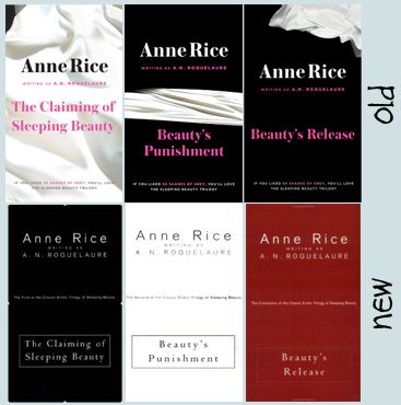
And lets not leave out a great marketing tactic... The Sleeping Beauty trilogy by Anne Rice is being re-released with very Fifty covers, and actually a quote on the outside that if you loved Fifty Shades you'll love this series. Having read only book one of this series and maybe being scarred for life because my virgin eyes couldn't handle this trilogy, I find this a bit false advertisement. It is a completely different series, with a much different feel to it. Very intense, extreme and not for the faint of heart.
But I think I draw the line at seeing a romantic suspense book being re-released with this type of cover. I just saw this morning the new cover for WILD CARD by Lora Leigh. I loved the book and I would actually love to buy one of those dog tags but you cannot take the hot half naked men out of romantic suspense covers. It is just not done!
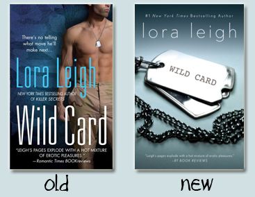
What happened to the pretty covers with beautiful artwork, sensual pictures of a couple (or more) and a lot of hot guys? I want them back!! As my boyfriend usually puts it, "if it doesn't have a half naked man on the cover you probably wouldn't be reading it..."

If it wasn't bad enough that Fifty now dominates all book conversation,
it now has to dominate all book covers as well? It isn't even the fact
that it is Fifty, which I admit I don't like, it is the fact that people
are copying and following this massive fad in an effort to trick buyers
in to purchasing their book, is it too much to ask for an original
idea? It is not as if the Fifty books have such brilliant covers that it
MUST be copied and quite frankly I miss my hot pictures of man boobies,
please bring them back!
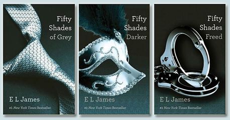
Now your turn... what do you think?


20 comments:
I hate that all book covers are becoming like Fifty. I'll quite happily admit that I dislike the series and this doesn't help. I feel none of the covers actually tell you anything about the plot and that's just doesn't work for me.
Of course, I've also being getting numerous emails/requests with the line "If you liked Fifty....." in the subject heading. Seems like publishers are trying to pull the same thing with consumers by making them look the same as the trilogy and cashing in on its success.
Amen, bring back the hottie cover models!!! I get that for SOME books, the simple covers work and it helps with the marketing, being able to be everywhere, yada yada... however, romance novels have ALWAYS had the billowy skirts and wind-blown haired man candy... it's like a trademark. I think that book covers need to be individualized to fit the book, if that means a simple cover, okay. But the simple cover thing is becoming over-used. BTW, those romance novels have always been on shelves everywhere, I see that all the time, even at the grocery store.
Anyhow, great post ladies! Book Savvy Babe
I'm neutral since most of my erotica books come in e-book form and I don't really even see a cover. I do understand why publishers are doing this though, since the books will now seem 'safer' for main stream selling. Target's ad this week featured several erotica books! But, all the covers were demure. Makes it easier for mom's to throw one in the cart with the kids in tow lol.
I get the whole less intimidating covers and they look better at Target and Walmart so they don't offend anybody but I miss the hotties, too.
That said, I do like some of them.
Marika
maw1725@gmail.com
I personally liked the old covers on most of the books you had pictured -the exception being the ones by Anne Rice - the best covers for those books were the ones for the Hardcover Editions -they are actually beautiful (I have them) and yes they are very intense and very dark. I don't like when publishers jump on a band wagon for things - I do like the new cover for Sylvia Day's book "Bared to You" because it does scream classy male but I despise the new cover for Seven Years to Sin - which I think is just horrible and less classy than the original cover. I liked the original cover for "The Dark Garden" but I can see the new cover working for the book because it's a flower after all - but the book isn't really about flowers so again - stick with the original. As for the Lora Leigh cover redo - I would feel ripped off - I love the original cover and thank goodness I have the original covers for the series!
I agree with ya and the Book Savvy Babe comment. I do not like it either. Bring back the hot book covers that tell me something about the said book. As an book reader consumer it really pisses me off with the "Fifty" trickery they are putting out there lately. I have not read that series and I will not ever read it even if it's free from the library! I love and adore Joey W. Hill's book series! They are thoroughly researched and epic-ally hot BDSM! Have you read anything from her yet? The Vampire Queen Series is to die for! ;)
DeAnna Schultz
I so am there with you about these "new" covers that are coming out. I was just at B&N and saw the new cover for Wild Card by Lora Leigh, and I was like, "Oh, HELL NO..."...and WHY???? For them trying to attract a new market, I give them kudos...but not this way...That was MY Nathan on the cover. And I am sick to death of running into 50 every where I turn. I was soooo happy that our Wal-mart didn't carry them...and WHAM--yestday they appeared and I scowled as I passed them by.
And if you are embarrassed to buy a hot cover for fear of ridicule?---GROW A SET ALREADY. Or get a eReader...that simple. Don't punish others with this 50 Shades look-alike...ENOUGH ALREADY.
these new covers are awful and lame!! I want my hotties on covers!! OK so I'm one of those person who gets embarrassed to be seen w/ one of these books *shame I know* but I still want the hotties in the covers!! I love the sensual couple on the covers of romance novels w/ the half-naked guy.
Love your post and hopefully publishers stop this stupid marketing technique that's just ticking off their original fanbase!
I can't stand the copycat covers! Enough w/ 50! Sometimes a simple cover is best, but sometimes you need that Hottie!
modularmates(at)comcast(dot)net
I think you have a really good point. I liked the 50 Shades covers, but that is not to say that I think every book should copycat. This happened in YA after Twilight and I got bored with those covers. Covers should always reflect the tone of their books.
Thanks ladies!
Wow, this is a good topic and one I thought only I noticed. While I'm not part of the group of hard core (no pun intended) Fifty fans, I do see the massive appeal of it and others like it. They can be liberating in a sense and to be honest, I am very glad that BDSM books have brought the topic of sex into the spotlight because there's nothing wrong with discussing it. However, BDSM books are definitely not for me, I prefer erotica without all the whips, chains and goodness knows what else and I'm thinking of having a discussion on my blog about the type of bedroom play preffered in romance novels and erotic novels.
I do like the idea of BDSM novels having a certain type of cover though, I wouldn't want to waste my time picking up those, reading the blurb and then realizing it's not my thing. I'm always in a hurry and 15 minutes in a book store does not go far.
That said, bring back my man candy book covers on every thing else! I love beautiful covers on my romance novels. I'm noticing that the historical romance genre is coming up with some breathtaking covers (Elizabeth Hoyt's Thief of Shadows cover still remains my favorite) and if they changed those to "Fifty" kind of covers well, I may have to riot.
Adria
Breath of Life Reviews
I can't decide... The simple covers don't bother me as long as they somehow make sense with the story line. They are mysterious in a way. I don't mind seeing bodies on the covers but I don't like seeing faces, it messes with what my vision of the characters in my head. I find the faces on the covers rarely look they way my imagination sees them and for some reason it annoys me! Bodies yes, faces no!!
I love my sexy covers featuring half naked dudes, strong sexy jaws, lips and or eyes showing...I could give a fuck what people think about what I'm reading I love those covers they're so pretty I hope this trend ends soon.
You nailed that on the head. If I see one more "If you loved loved Fifty you'll love...." I'm gonna scream. I didn't like Fifty so guess what you just steered me away from your book. I like my smutty books with a nekkid man on the cover, preferably with nipples.
I can see where marketing is going with it though, authors too. Fifty is selling, lets all make a buck in its coat tail while they can. It may also open up the non-readers who were wowed by Fifty to new authors who deserve to be noticed.
I think the hot cover models draw me in more than objects. I try not to judge a book by its cover but it happens.
Re-issuing with these type of covers is a marketing double edged sword. You risk alienating your existing fans, or those who didn't jump on the Gray bandwagon.
You also get the chance to appeal to new fans and therefore broaden your readership.
I am not a fan of the cover changes, unless of course it makes sense. The Bared to You cover change... that one makes sense to me.
But I will admit, when I saw the new Wild Card cover I was like "Hell no!" That entire series had hot covers and you don't mess with perfection!
Great post ladies!
Jessie
Great post! very well said. and i totally agree with all your points. i miss the hot guys on the covers. although for 'bared to you', i think i like both the new and old cover.
fifty is like twilight all over again but now it is on the "adult" level. it has also now become a fad that totally irks me. i mean, it isn't even THAT good, so why all the fuss?
I prefer the old covers. I am tire of the Fifty Shades refernences. At first I thought it would help the genre gain readership, but now I am just done with it. The truth is there are great writers and books with an established fan base. . The comparisons are not doing justice to those authors or their stories.
The readers who predate the "fifty shades explosion" will continue to buy, read and share books with other people who love these books and do it in a positive, supportive manner.
I blame the original TWILIGHT series covers for the whole trend. Although I do like the simplicity of the new cover art, I don't buy books with covers like that. If a book doesn't have one of my favorite cover models on it, I'm not going to buy it (unless the author is a must-buy author).
I'm kind of so-so on the cover changes. The Sleeping Beauty ones even mentioning Fifty are just ridiculous. I have the hardcovers and they have more of a fairytale theme to them which suits it obviously so changing them to modernize them just doesn't make sense.
The Dark Garden new cover just looks like a Twilight reject.
But a cover doesn't decide what books I love, thankfully, or I never would have read Knight or the R L Mathewson's books.
My favourite book covers belong to Paranormal Romance though.
Post a Comment