
Chicagoland Vampires
by Chloe Neill
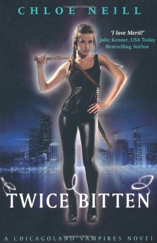
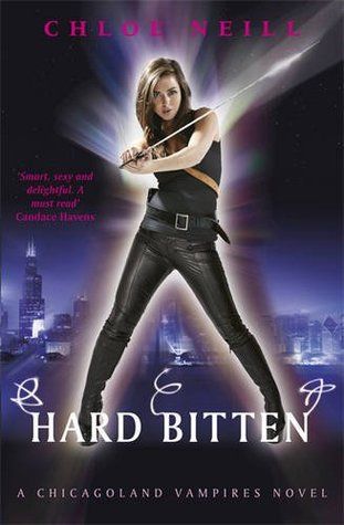
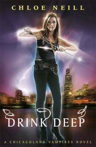
It is almost that time for the year. Yes a new book is coming out in the Chicagoland Vampires series, and hopefully it will answer all your questions! But while you wait, how about sharing your thoughts about the different covers for this series? This is really a no brainer for me, the US covers are so much better IMO. I feel like the girl is just floating in the middle of nowhere in the UK covers! What do you think??
And stay tuned... I'll be posting my review of Drink Deep at some point this weekend!
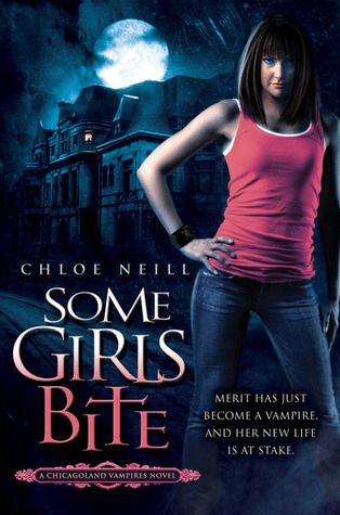
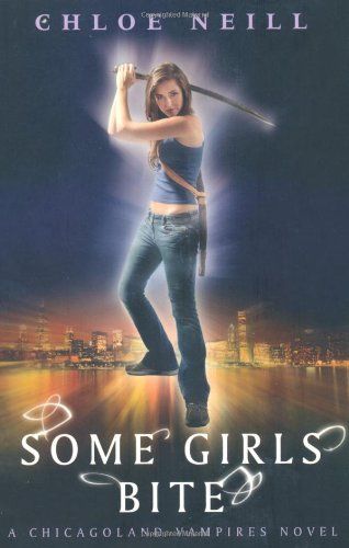
USA UK
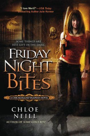

USA UK
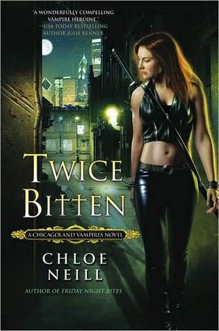
USA UK

USA UK

USA UK
So what do you think??
Cast your votes below and leave your comments!


10 comments:
Honestly, if I saw the UK cover books in the library or bookstore I wouldn't have even picked them up to see what they were about. They just look cheap and weird!
I´m with kittenmittens on this one! The US covers are way better!
USA! IMO.
KittenMittens took the words right outta my mouth!
I honestly hate both versions. I wouldn't have picked them up at all.
Ann
I'm not in love with either really but I think USA has the better covers.
The UK covers seem like the covers for a YA series, I wouldn't pick them up if I saw them.
Kitten said it best. The first cover alone in book 1 really doesn't work. They all seem a bit amateur, like she is posing in front of her mirror or something LOL! They definitely look like they are more for a YA series for sure. She just doesn't look like the badass I know she is. Sorry UK! :(
The US covers are definitely better than the UK covers! Which is funny because it's usually the other way around. The girl on the UK covers looks like a joke compared to the girl on the US covers. The US cover girl looks more fierce. The UK cover girl is not a fitting choice for a UF novel.
US for sure
Post a Comment